In a sea of emails, how do you ensure yours is the one that stands out, sparks curiosity, and drives action? The answer lies in high-impact email designs. Crafting the perfect subject line alone won’t cut it—your emails must grab attention from the moment they hit the inbox.
 Whether through bold visuals, engaging GIFs, a clear and persuasive call to action, or a seamless, mobile-friendly layout, your email’s design can differentiate between being ignored and converting a customer. If you want your emails to do more than land in inboxes, it’s time to elevate your design and start turning opens into clicks.
This blog will break down essential email design strategies that improve engagement, encourage customer retention, and enhance your overall email marketing efforts.
The Impact of Email Design on Conversions

A banner for TUFF – a wrist wraps and apparel brand.
Email design is critical to how recipients engage with your brand. According to a study, emails that use segmented, personalized design elements generate 58% of all revenue. This proves that email marketing is about reaching customers and creating a seamless experience that encourages clicks, purchases, or subscriptions while fostering customer retention.
Visual elements like eye-catching banners or dynamic GIFs do more than grab attention—they extend the time customers spend engaging with your content, ultimately driving higher conversions and strengthening retention marketing strategies.
Every moment they remain captivated by your email’s design brings them closer to taking action. These are what we call “scroll-stopping emails.” They don’t just catch attention—they hold it.
Each scroll reveals something new and exciting, keeping the recipient invested and eager to explore further. Every well-designed section makes them pause, appreciate, and interact, increasing their likelihood of clicking through.
6 Effective Strategies to Create a High-Converting Email
Integrating key design elements that captivate readers and encourage action is crucial for converting your email campaigns. Below are the key email design strategies that stand out and drive action.
1. Focus on Visual Hierarchy
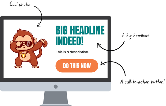
Visual hierarchy is a design principle that arranges elements in a way that naturally guides the reader’s eye to the most important parts of the email. By prioritizing key content such as headlines, images, and CTAs, you can ensure your audience focuses on the actions that matter most.
Here’s how to establish a strong visual hierarchy:
- Use larger fonts for headlines: Ensure key messages, like offers or product names, stand out by using larger and bold fonts.
- Prioritize key content: Place the most important information at the top, where readers’ attention is highest, and use varying sizes for elements to create contrast.
- Utilize color contrast: Use contrasting colors to highlight specific sections or calls to action and draw attention to clickable elements.
Establishing a clear visual hierarchy helps your audience navigate your email effortlessly, ensuring they focus on what’s most important while increasing conversions.
2. Use Engaging Visuals
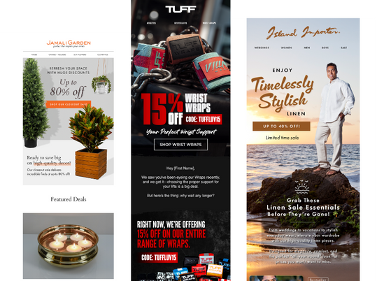
Visuals are the backbone of effective email design but must be used strategically to stand out. A well-placed image or GIF isn’t just about looking good—it’s about capturing attention and guiding the reader toward action. Thoughtfully chosen visuals, like product images, infographics, or dynamic banners, should pull the recipient in and direct their focus to your CTA.
Perform these actions to make visuals work for you:
- Keep it balanced: Use a mix of text and visuals to maintain flow.
- Optimize images: Compress images to reduce load times and ensure they display well on mobile devices.
- Use alt text: For recipients who can’t view images, alt text ensures your message gets across.
It’s no wonder that 53% of marketers incorporate visuals into their email marketing strategies, as these help capture attention and drive engagement.
3. Design Clear, Action-Oriented CTAs
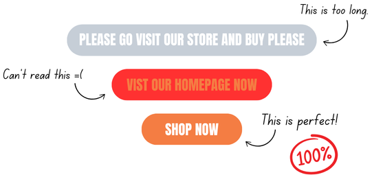
Your call-to-action (CTA) is the driving force behind conversions. It needs to be clear, actionable, and prominently placed. Moreover, your CTA button’s design matters—use contrasting colors that draw attention and compelling text.
Here’s how to design effective CTAs:
- Use contrasting colors: Make sure your CTA button stands out against the background.
- Place it prominently: Don’t bury your CTA at the bottom of the email—ensure it’s easy to find, whether at the beginning, middle, or end of your email, depending on the message.
- Make it actionable: Use strong, direct language like “Shop Now,” “Get Started,” or “Claim Your Discount.”
A strong CTA is the final piece that ties your email together and encourages recipients to take action, which is key to driving conversions and retaining customers.

4. Optimize for Mobile Devices
Did you know that 55% of emails are opened on mobile devices? If your emails aren’t optimized for mobile, you could lose a significant portion of your audience.
A mobile-first design ensures your emails are easily read and interact with smaller screens. To provide mobile responsiveness, do the following:
- Leverage responsive templates: These automatically adjust the email layout based on screen size.
- Keep it simple: Mobile screens are smaller, so stick to concise text and easy-to-tap buttons.
- Test on multiple devices: Always test your emails on different devices to ensure they look great everywhere.
5. Incorporate Sections
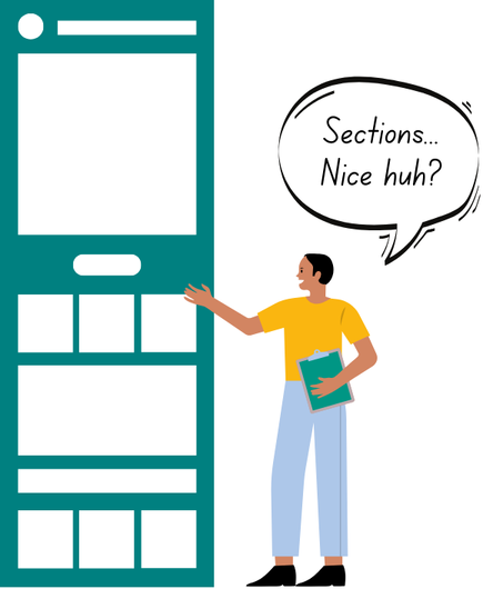
Structuring your emails with well-defined sections makes navigating and engaging with the content easier for recipients. Banners, product recommendations, and customer reviews can create an intuitive flow that guides the reader toward your call to action.
Here’s how to use sections effectively:
- Banner: Use a large, visually appealing banner at the top to highlight a key offer or announcement.
- Product Recommendations: Dynamically show products tailored to the recipient’s behavior or preferences to drive engagement.
- Customer Reviews: Social proof adds credibility. Incorporate short reviews or testimonials to build trust and increase conversions.
Organizing your emails with clear, engaging sections ensures a more seamless experience for your readers, encouraging them to interact with multiple elements within the email.
6. Maintain Consistent Branding
Consistency in design and branding helps create a seamless customer experience across all touchpoints. Consistent brand presentation across all platforms can increase revenue by up to 10-20%. Your email should match your website, social media, and overall brand image to reinforce brand recognition and trust.
Some elements to keep branding consistent in your emails include:
- Brand colors and fonts: Ensure your email visually aligns with your brand’s color palette and typography.
- Brand logo: Placing your logo in a prominent location (often the top) reinforces brand identity.
- Brand layout: Repeat familiar email structures so your audience knows what to expect.
Consistent branding helps your email stand out as part of your brand’s ecosystem, reinforcing trust and driving engagement.

Boost Your Conversions with Expert Email Design
Your emails need to do more than land in an inbox—they need to engage, convert, and retain customers. From the first banner to the final call-to-action, scroll-stopping emails keep readers curious and invested, compelling them to continue scrolling and interacting.
The longer your recipient engages with your email, the more likely they are to take action—click a link, make a purchase, or sign up for a service. Effective email marketing can turn leads into loyal customers and boost long-term customer retention.
Ready to take your emails to the next level? Reach out to us today to optimize your email strategy for maximum impact!

